Introducing the selected maps from Design in Geovisualization & Thematic Cartography courses.
Map Collections
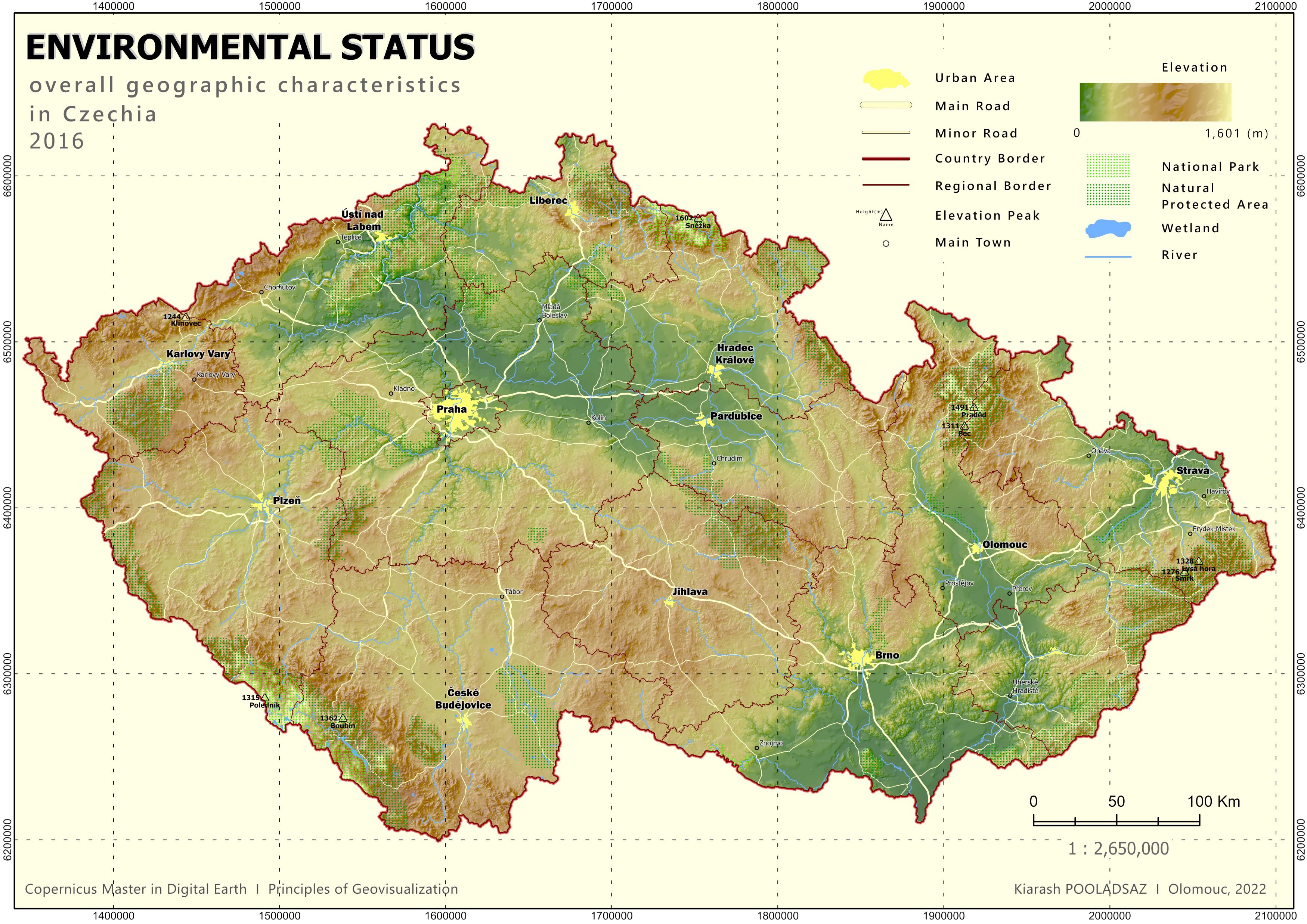
A topographic map is a detailed representation of the Earth's surface that utilizes contour lines, hillshade, or elevation choropleth layer to depict elevation, along with main cities, roads, and various environmental symbols. The hillshade technique simulates the effect of sunlight on the landscape, highlighting the shadows and slopes of mountains, valleys, and plateaus. Major cities and towns are labeled, and roads and highways are depicted using different line types and symbols. Water features such as rivers, lakes, and wetlands are also included, along with symbols representing landmarks and environmental features. The map typically provides a scale bar, latitude and longitude coordinates, and grid lines for navigation and measurement purposes. Hillshade topographic maps are valuable tools for various activities, offering a comprehensive understanding of the physical characteristics of an area while providing a visually appealing representation of the landscape.
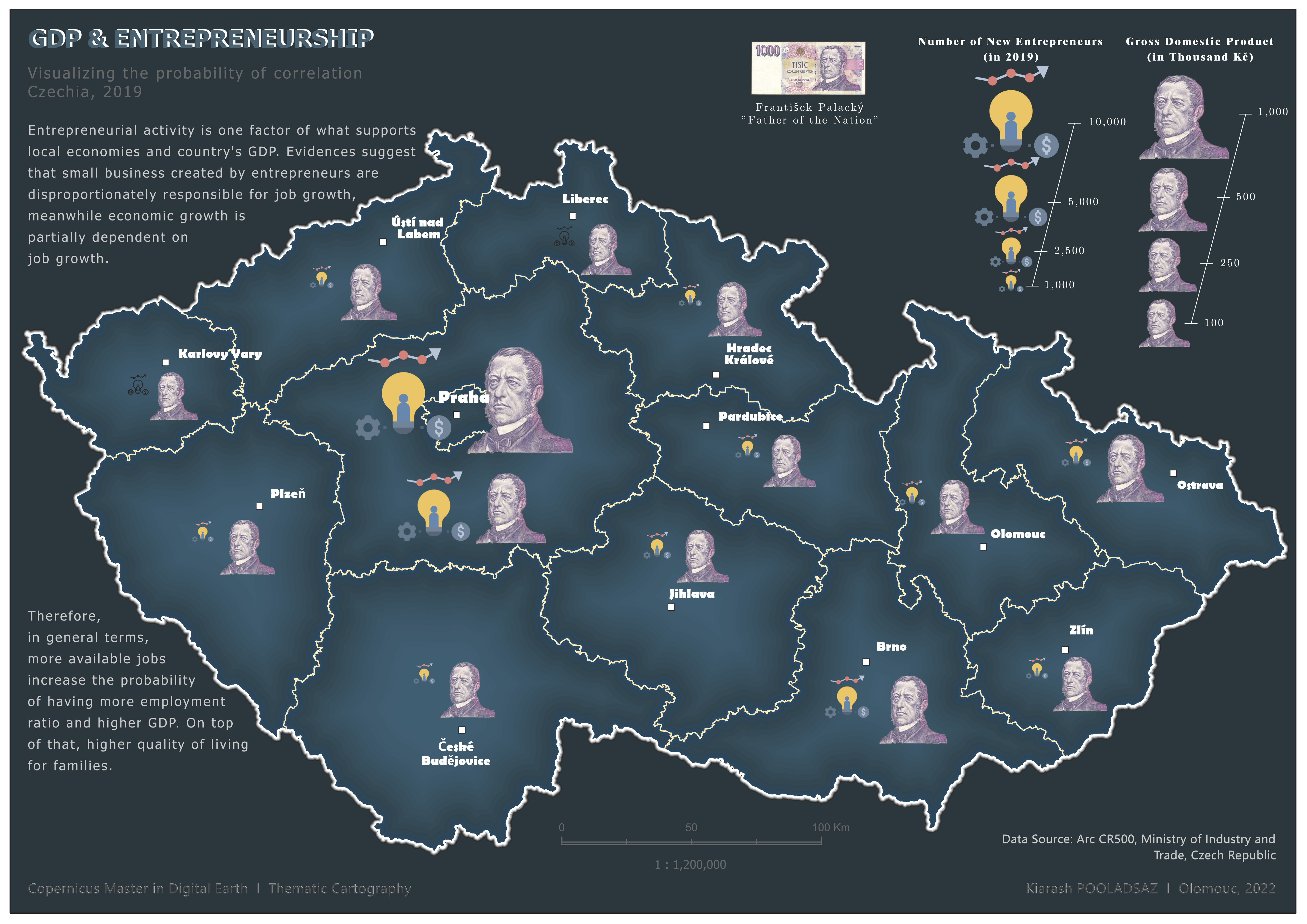
Infographics are essential tools in the creation of map posters and presentations. They serve to visually communicate information in a concise and engaging manner. By incorporating elements such as charts, graphs, and icons, infographics allow for the clear representation of complex data sets and trends related to the mapped area. They facilitate storytelling by presenting information in a sequential and logical manner, guiding the viewer through the key points and insights of the map. Infographics also simplify complex information, making it more accessible and understandable to the audience. Through the use of colors, typography, and design elements, they enhance the visual appeal of map materials, capturing the attention of viewers and making the information more memorable. Ultimately, infographics play a crucial role in effectively conveying information and enhancing the impact of map posters and presentations.
Choropleth maps provide a visual representation of patterns and trends through color gradations, allowing viewers to quickly grasp the spatial distribution and variations in the related matter. These maps enable spatial analysis, highlighting differences between geographic areas and facilitating easy comparison and contrast. By assigning colors to different data ranges, choropleth maps effectively communicate the magnitude or intensity of the matter. Labels or numerical values could accompany the map to provide precise information, such as the percentage or number of migrants in important municipalities. The choropleth graduate map would allow viewers to grasp the spatial distribution and variations in emigration and immigration across the region, highlighting areas of high or low migration activity. In our case here, they serve as engaging storytelling tools, capturing the attention of viewers and conveying narratives related to emigration and immigration.
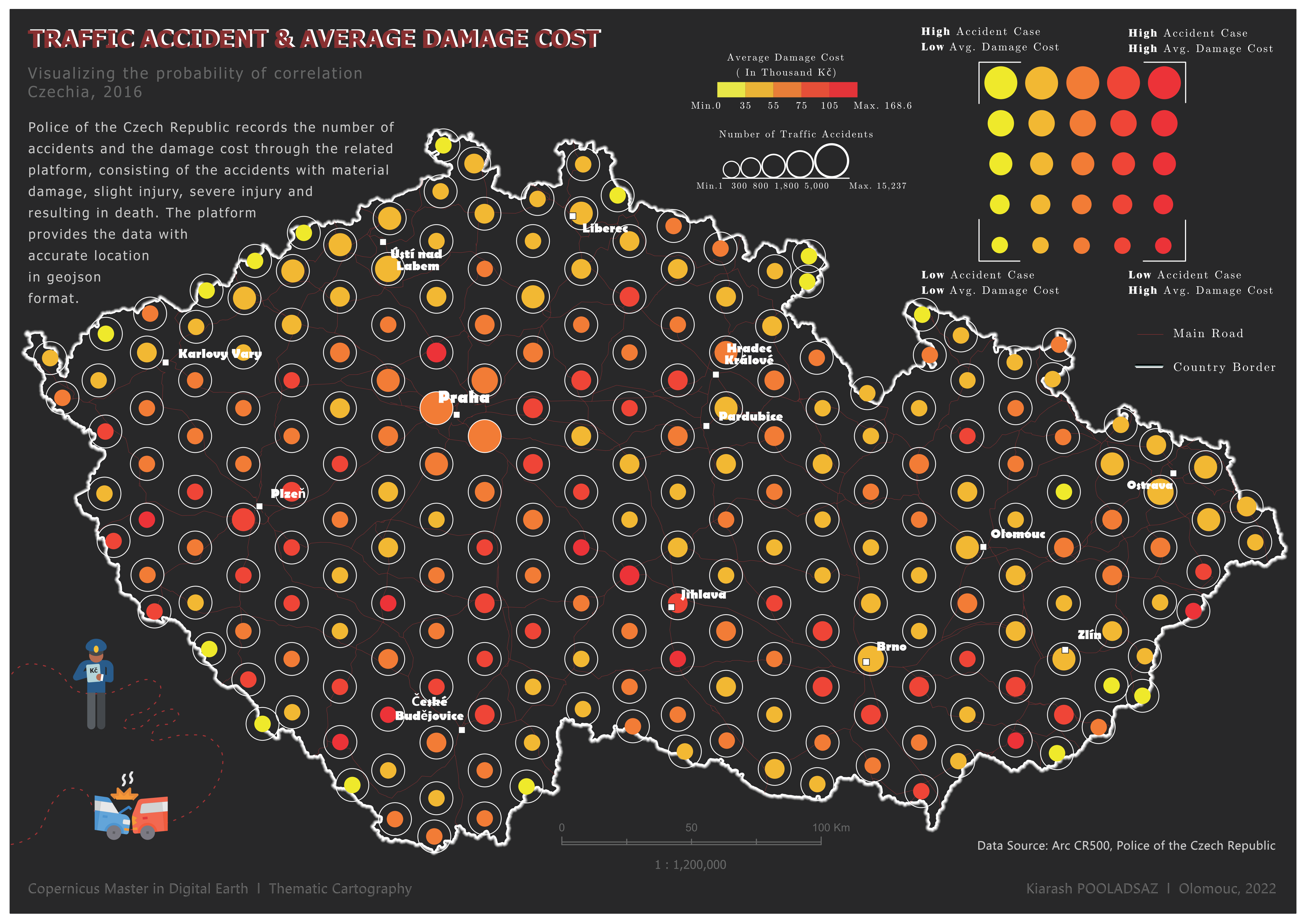
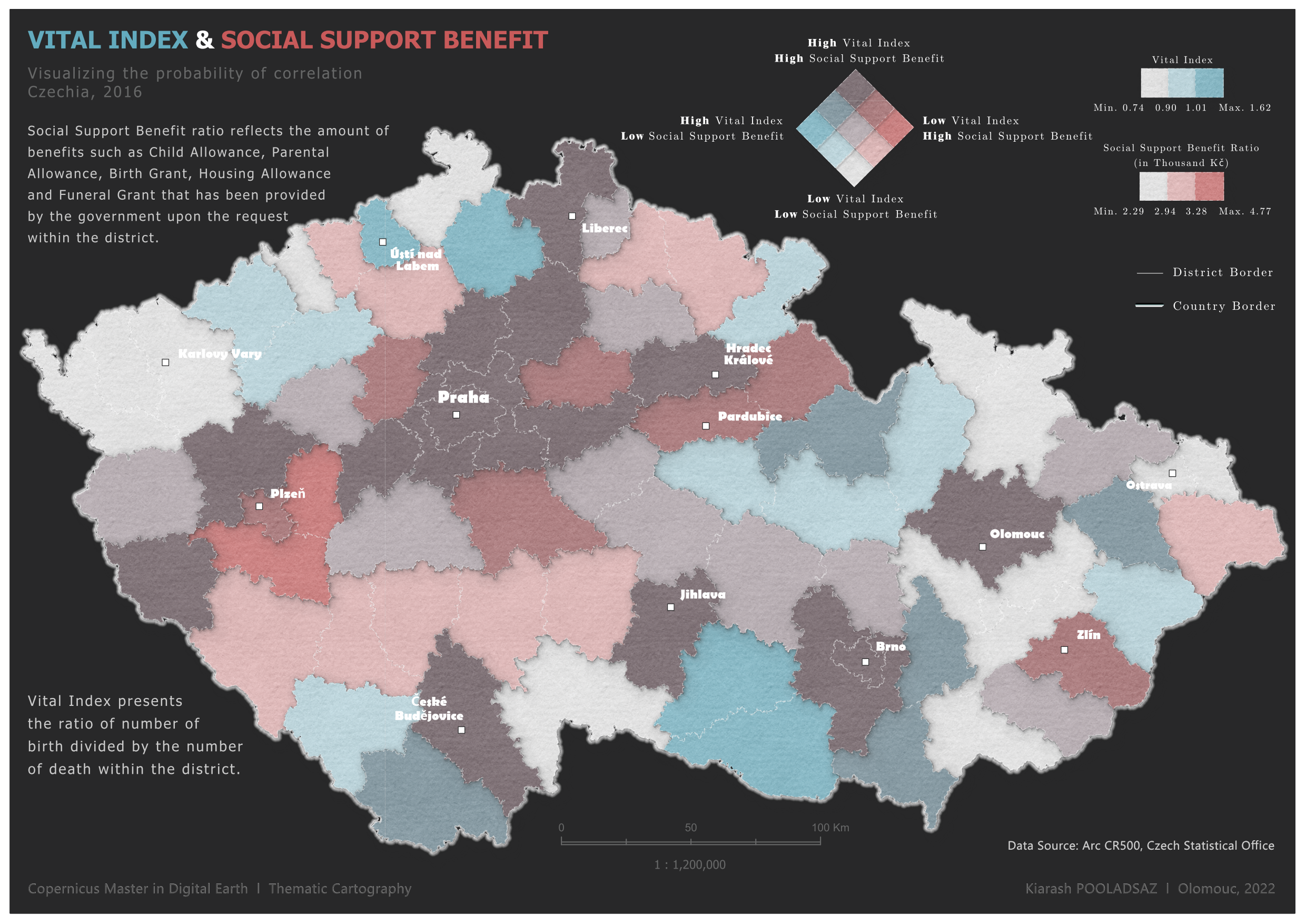
Bivariate and multivariate maps are thematic maps that represent multiple variables simultaneously. Bivariate maps display two variables on a single map, allowing for the examination of relationships and patterns between the two. Multivariate maps go a step further by representing three or more variables using various visual variables such as color, size, shape, or texture. These maps enable the exploration of complex spatial relationships, revealing associations, disparities, and patterns across multiple factors within a geographic context. By visually integrating multiple variables, bivariate and multivariate maps facilitate deeper insights, analysis, and communication of complex data, enhancing our understanding of the interplay between different variables within a given area.